
October 22, 2026 · Michael Oracle
My website uses static service pages alongside a WordPress blog. That arrangement creates more than one place where navigation can be stored. A review found that clean service addresses and older .html links needed to be brought into agreement.
Read article ↗: Website case study: bringing blog links and service URLs into agreement
October 22, 2026 · Michael Oracle
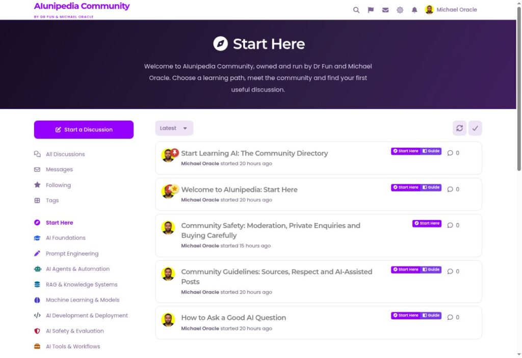
A community’s Start Here page should reduce uncertainty for a new member. It needs to explain the purpose of the space, point to useful starting discussions and make the first contribution feel manageable. A decorative welcome message alone does not complete that job.
Read article ↗: Community case study: making a Start Here page useful to a new member

October 22, 2026 · Michael Oracle
The Oracle AI Dictionary demonstrates a useful distinction between an interactive tool and a reference page. The app lets people explore terms, while dedicated pages give definitions a stable address that can be linked, shared and read as ordinary content.
Read article ↗: AI Dictionary case study: giving useful definitions their own pages
October 22, 2026 · Michael Oracle
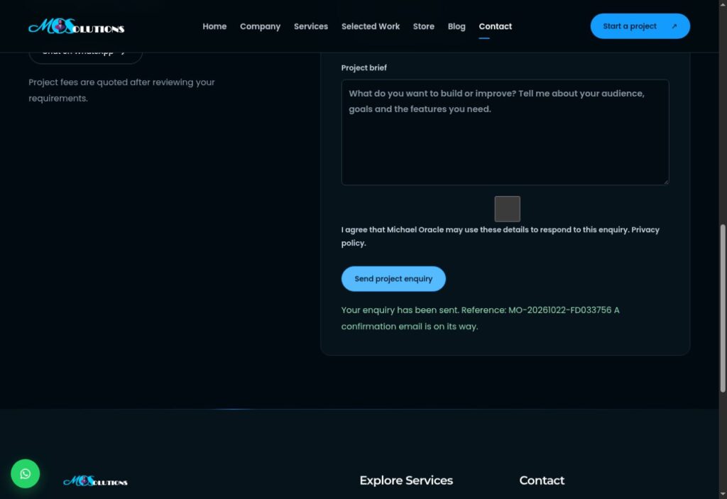
My contact page originally prepared a message for visitors to send through WhatsApp or their email application. That made the handoff explicit, but it added a step after completing the form. The upgrade replaced that workflow with direct server-side submission and an acknowledgement.
Read article ↗: Case study: replacing my message-preparation form with direct enquiries

October 22, 2026 · Michael Oracle
A launch review of my personal website showed why a page opening successfully is not enough to make it ready for search. Public content needed its crawl and indexing instructions checked, while private project areas needed to remain excluded and protected.
Read article ↗: Launch case study: making my public website ready to be crawled

October 22, 2026 · Michael Oracle
Checkout abandonment can reflect unexpected costs, unsuitable payment options, uncertainty or a technical failure. It does not always mean customers disliked the product. Review the actual order journey before redesigning the store or increasing advertising spend.
Read article ↗: Why do customers abandon checkout, and what should I check?

October 22, 2026 · Michael Oracle
A product page should help a customer decide whether the item fits their need and what happens if they order it. A title, photograph and price may be insufficient when size, compatibility, condition or delivery changes the decision.
Read article ↗: What information should an online product page include?
October 22, 2026 · Michael Oracle
Show delivery costs as early as you reasonably can and explain when the final amount depends on location or order details. A customer should not have to guess whether the displayed product price is close to the amount they will actually pay.
Read article ↗: How do I make delivery costs clearer before checkout?
October 22, 2026 · Michael Oracle
Your website should confirm payment through the payment provider’s server-side verification or authenticated event mechanism before delivering value. A browser success screen or customer screenshot alone is not a dependable source of payment status.
Read article ↗: How should my website confirm that an online payment succeeded?
